The UI System
The UI system, while being a bit complicated, is very powerful. It allows you to create custom UIs such as menus, HUDs, and more.
The Basics
A UI is made up of components. A component is a single piece of the UI. Think of them as objects, but more advanced.
Let's take the main menu as an example. The soul is a component, each menu item is a component, and the Kristal logo is a component.
Components all do different things, and are all used in different ways. You can even create your own components if required, which is more than likely.
There are many types of components, but they all have a few things in common:
- They all have a parent, except for the root component.
- They can all have children, like any other object.
- They all have sizings.
- They all have margins and paddings.
But what do these things mean, exactly?
The Anatomy of a Component
Margins and Paddings
As stated before, components have margins and paddings. What are these things, and why do all components have them?
The answer becomes quite clear when you remember that components can have children. Margins and paddings are used to space out components from each other.
A component is a box. A margin is the space between the box and other boxes, and a padding is the space between the box and its contents. Margins and paddings can be different for each side, as well.
In the following image, both the margins and the paddings are 20 pixels on each side. The cyan area represents the margins, and the pink area represents the paddings. The white box is the component itself.
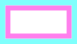
In Kristal, turning on debug rendering will show you the margins and paddings of each component.
Sizings
Sizings determine the size of a component. There's a horizontal sizing and a vertical sizing.
FixedSizing(number size, number? size_2)
This sizing is simple. It makes the component a fixed size which will not change.
If size_2 is provided, the sizing will assume that size is the width and size_2 is the height.
This means that FixedSizing(100, 100) is the same as FixedSizing(100).
FillSizing()
This sizing makes the component "fill" the parent component -- it will be the same size as the parent, minus any paddings the parent has, and minus any margins the component has.
FitSizing()
This sizing makes the component shrink or grow to fit to its contents.
An example of using both FillSizing and FitSizing is a menu item.
You'd want the menu item to stretch horizontally to fit the menu, but you'd want the height to be the same as whatever's inside the menu item, such as text.
Layouts
Basically, a layout is a way to position child components inside of a component.
There's two different layout types, HorizontalLayout and VerticalLayout.
When creating a layout, you're able to specify options for it, like the gap between components, or the alignment.
There's six alignment modes:
"start": Aligns the components to the start of the component."center": Aligns the components to the center of the component."end": Aligns the components to the end of the component."space-between": Aligns the components evenly. The first and last components are flush with the start and end of the layout."space-around": Aligns the components evenly. Acts as if there's invisible spacing around each component."space-evenly": Aligns the components evenly. The same spacing is used everywhere, including the first and last components.
That's a bit confusing, so here's visual examples:
"start"

"center"
"end"

"space-between"
"space-around"

"space-evenly"
Finally, it's time to make something!
Making a UI
Making a UI is simple. You just need to create a component, and then add it somewhere.
If you're in the overworld, add it to Game.world! In a battle, try Game.battle.
If it can be anywhere, at any time, try Game.stage.
Now, let's make the component, and add it!
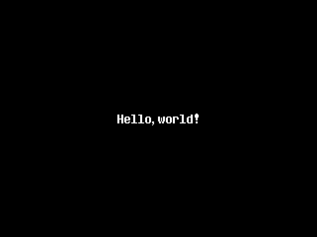
local root = Component(FixedSizing(640, 480)) -- The root should be a fixed size.
    root:setLayout(VerticalLayout({ gap = 0, align = "center" })) -- Center it vertically!
    root:addChild(Text("Hello, world!")) -- Add a text object to it!
Game.stage:addChild(root) -- Add it to the stage!
Assuming you run this in a black void, you should see the following result:

Perfect! Our component is 640x480, and the child is centered vertically!
Turning on debug rendering will help a little in understanding what's going on:
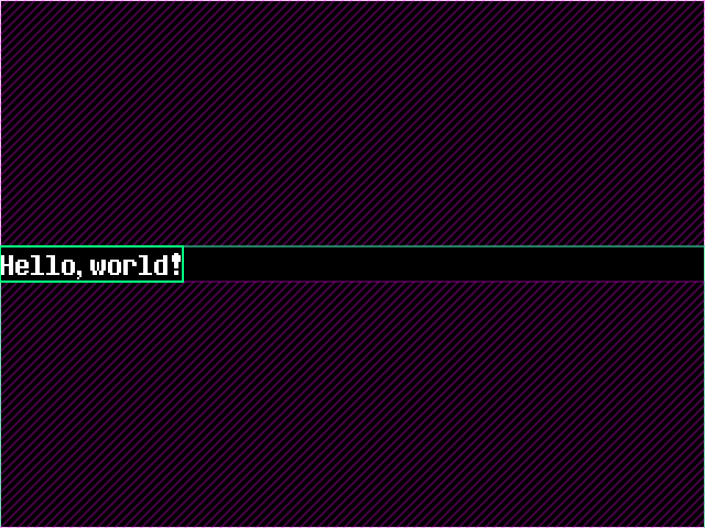
"What do you mean centered? It's at the left!"
This is a vertical layout, therefore it's centered vertically. Vertical layouts don't touch horizontal alignment at all. So how do we align it horizontally as well, if we want it to be in the middle of the screen?
That's easy! Let's just make a horizontal layout!
local outer = Component(FixedSizing(640, 480)) -- The root should be a fixed size.
    outer:setLayout(VerticalLayout({ gap = 0, align = "center" })) -- Center it vertically!
    local inner = Component(FillSizing(), FitSizing()) -- Stretch horizontally, fit to content vertically
        inner:setLayout(HorizontalLayout({ gap = 0, align = "center" })) -- Center it horizontally!
        inner:addChild(Text("Hello, world!")) -- Add a text object to it!
    outer:addChild(inner) -- Add the inner component to the outer component!
Game.stage:addChild(outer) -- Add it to the stage!
This should result in the following:
And with debug rendering:

"Wait, hold on, I'm confused. What's going on?"
Let's break it down.
First, we create the outer component, or the root component. This is the component which'll hold everything else. It'll center its children vertically.
Next, we create the inner component, which is the first and only child of the outer component. Remember, the outer component centers its children vertically, so the inner component will be centered vertically.
The inner component will stretch horizontally to fill the outer component, and it'll fit to its contents vertically. That means, the inner component will be the same width as the outer component, and the same height as its children.
So, we add a child to it -- a text object. Again, the inner component will be the same size as the text vertically, but stretch to fill the outer component horizontally.
We make the inner component center its children horizontally, to finish the alignment puzzle. The text inside of it will now be centered horizontally.
Finally, we add the inner component to the outer component, and the outer component to the stage, to finish it off.
We've successfully centered a component, both horizontally and vertically! That... was a lot of work, though. Is there anything we can do differently?
No, and here's why
Anything powerful needs to be complicated. That's just how it is. Sure, we could make a million different layout types, but how would that interact with wrappin- oh no.
Wrapping, where are you?
If you try to cram too many components into another component, it'll start to wrap. Ideally. In reality, it'll just overflow.

This component is 320x240. We're adding 8 children to it, 32 pixels tall each, with a gap of 8 pixels between elements.
Let's do 8 * (32 + 8). That's, uh, 320. 320 is larger than 240, the height of the component. Oh no.
There's no wrapping, so what do we do? Simple: we pick an overflow mode.
Overflow modes
There's three overflow modes: "visible", "hidden", and "scroll", which you can use with component:setOverflow(mode).
"visible"
This is the default overflow mode. It'll just let the component overflow, and it'll be visible.
"hidden"
This overflow mode will hide any overflowing components. They'll be invisible.
"scroll"
This overflow mode will let you scroll the component.
- You can use
AbstractMenuComponent:setScrollType(type)with either"paged"or"scroll"(default).
"You keep talking about wrapping, or a lack thereof. Just get to the point already!"
Fine, fine. Wrapping is complicated. It's not something you can just add, and it'll work perfectly. There's a lot of things to consider.
That means, for the moment, there's no wrapping. I'll be honest, I wasn't able to figure out a good way to do it.
If you need wrapping, maybe it's a good idea to manually position your components. That's something you can do, by the way.
Manual positioning of components
Ever wonder what happens if you don't call component:setLayout(layout)? Well, simple, it doesn't have a layout.
Or rather, it has the default layout, quite simply named Layout.
The default layout snaps components to the top-left corner of the parent component (taking into account margins and padding), adjusts their positions based on scrolling, and... that's all.
Both HorizontalLayout and VerticalLayout do the same thing, and just do more on top of that.
They always start by snapping components to the top-left corner.
Anyway, how do we actually choose the positioning of a component? Just setting the x and y properties can't be it, right?
You're right -- that's not it. Layouts actually set the x and y properties of components, so setting them yourself will just be overwritten.
This is where a bit of jank comes in. You can use the child's margins to offset the position from the top-left corner.
So, instead of doing something like:
component.x = 100
component.y = 200
You'd do something like:
component:setMargins(100, 200, 0, 0)
This... is not ideal, but it works. You're not really supposed to manually position components, but it's possible.
Input, menus, and all that jazz
Okay, okay, enough with the boring stuff. We want to actually make a menu.
Let's start with the basics: input. How do we get input?
Input, focusing, and the focus stack
When you focus a component, it'll receive input. Simple, right? But how do you focus a component?
Also simple -- component:setFocused().
But what if multiple things want to be focused? Well, that's where the focus stack comes in.
Basically, only one thing can be focused at a time. But let's say you have a menu, that goes into another menu. That first menu gets focused, and then you open the second menu through it. Then, that second menu gains focus. But, while that first menu is no longer focused, it's still in the focus stack. That means, the moment the second menu disappears, the first menu will regain focus! No longer will you have to worry about input being sent to multiple things at once.
"Hurry up and show us how to make a menu already!"
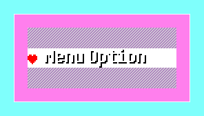
Let's start with the basics. We'll make a menu with two options: "Play" and "Quit".
Let's use our centered component code from earlier:
local outer = Component(FixedSizing(640, 480)) -- The root should be a fixed size.
    outer:setLayout(VerticalLayout({ gap = 0, align = "center" })) -- Center it vertically!
    local inner = Component(FillSizing(), FitSizing()) -- Stretch horizontally, fit to content vertically
        inner:setLayout(HorizontalLayout({ gap = 0, align = "center" })) -- Center it horizontally!

        -- anything we add to inner will be centered horizontally
    outer:addChild(inner) -- Add the inner component to the outer component!
Game.stage:addChild(outer) -- Add it to the stage!
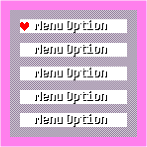
Now, let's add a box! Like, that fancy box that DELTARUNE uses.
local box = BoxComponent(FitSizing()) -- make the box fit to its contents
And then let's add the actual menu inside of it, with a few items:
local menu = BasicMenuComponent(FitSizing(), FixedSizing(240))
menu:setLayout(VerticalLayout({ gap = 0, align = "start" }))

menu:addChild(TextMenuItemComponent("Option 1", function() print("Option 1 was selected!") end))
menu:addChild(TextMenuItemComponent("Option 2", function() print("Option 2 was selected!") end))
menu:addChild(TextMenuItemComponent("Option 3", function() print("Option 3 was selected!") end))
menu:addChild(TextMenuItemComponent("Option 4", function() print("Option 4 was selected!") end))
menu:addChild(TextMenuItemComponent("Option 5", function() print("Option 5 was selected!") end))

menu:setFocused()
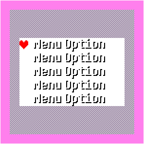
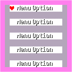
Perfect! Putting that all together, we get:
local outer = Component(FixedSizing(640, 480)) -- The root should be a fixed size.
    outer:setLayout(VerticalLayout({ gap = 0, align = "center" })) -- Center it vertically!
    local inner = Component(FillSizing(), FitSizing()) -- Stretch horizontally, fit to content vertically
        inner:setLayout(HorizontalLayout({ gap = 0, align = "center" })) -- Center it horizontally!
        -- anything we add to inner will be centered horizontally

        local box = BoxComponent(FitSizing())
            local menu = BasicMenuComponent(FitSizing())
                menu:setLayout(VerticalLayout({ gap = 0, align = "start" }))
                menu:addChild(SoulMenuItemComponent(Text("Option 1"), function() print("Option 1 was selected!") end))
                menu:addChild(SoulMenuItemComponent(Text("Option 2"), function() print("Option 2 was selected!") end))
                menu:addChild(SoulMenuItemComponent(Text("Option 3"), function() print("Option 3 was selected!") end))
                menu:addChild(SoulMenuItemComponent(Text("Option 4"), function() print("Option 4 was selected!") end))
                menu:addChild(SoulMenuItemComponent(Text("Option 5"), function() print("Option 5 was selected!") end))

                menu:setFocused()
            box:addChild(menu)
        inner:addChild(box)
    outer:addChild(inner) -- Add the inner component to the outer component!
Game.stage:addChild(outer) -- Add it to the stage!
Now, since the menu is focused, you can use the arrow keys to navigate it, and press confirm to select an option!
The docs aren't working yet, so what're the components?
Glad you asked.
Component
AbstractMenuComponent- Base menu componentBasicMenuComponent- Basic menu which uses arrow keys and confirm/cancelEasingSoulMenuComponent- Menu which uses a soul that eases between items
AbstractMenuItemComponent- Base menu item componentSoulMenuItemComponent- Menu item which uses a soul to indicate selection, can be combined withEasingSoulMenuComponentTextMenuItemComponent- Menu item which is just text, by default turns yellow when selectedTextInputMenuItemComponent- Menu item which is a text inputListMenuItemComponent- Menu item which is a list of itemsArrowListMenuItemComponent- Menu item which is a list of items, with arrowsIntegerListMenuItemComponent- Menu item which is a range of integersArrowIntegerListMenuItemComponent- Menu item which is a range of integers, with arrows
BooleanMenuItemComponent- Menu item which is a toggleLabelMenuItemComponent- Menu item which is a label for its child, passes focus to its child
BoxComponent- A UI boxMainMenuBoxComponent- A UI box style used in the main menuBar- A progress barScrollbar- A scrollbar, can be attached to scrolling objects like menusSeparator- A separator, can be vertical
Layout
Sizing
Examples?
Menu with scrollbar, easing, and a lot of item types, submenu, and paginated scrolling:
local soul = Game.stage:addChild(EasingSoul(0, 0))
soul.use_parent = true

local box = MainMenuBoxComponent(FitSizing())
    local menu = EasingSoulMenuComponent(FitSizing(), FixedSizing(240), { hold = true, soul = soul })
        menu.open_sound = "ui_move"
        menu:setScrollbar(ScrollbarComponent({gutter = "dotted", margins = {8, 0, 0, 0}, arrows = true}))
        menu:setLayout(VerticalLayout({ gap = 0, align = "start" }))
        menu:setOverflow("scroll")
        menu:setScrollType("paged")

        menu:addChild(LabelMenuItemComponent("Label: ", IntegerMenuItemComponent(1, 10, 1), FillSizing(), FitSizing()))
        menu:addChild(SeparatorComponent())
        menu:addChild(TextInputMenuItemComponent())
        menu:addChild(BooleanMenuItemComponent(false, function(value) end))
        menu:addChild(ListMenuItemComponent({ "List Option 1", "List Option 2", "List Option 300" }, 1, function(index) end))
        menu:addChild(ArrowListMenuItemComponent({ "List Option 1", "List Option 2", "List Option 300" }, 1, function(index) end))
        menu:addChild(IntegerMenuItemComponent(1, 10, 1, function(value) end))
        menu:addChild(IntegerMenuItemComponent(1, 10, 1, function(value) end, {wrap = false, hold = true}))
        menu:addChild(ArrowIntegerMenuItemComponent(1, 10, 1, function(value) end))
        menu:addChild(ArrowIntegerMenuItemComponent(1, 10, 1, function(value) end, {wrap = false, hold = true}))
        -- recreate the deltarune volume controller
        menu:addChild(ArrowIntegerMenuItemComponent(0, 100, 60, function(value) Kristal.setVolume(value / 100) end, {step = 2, suffix = "%", sound = "noise", wrap = false, hold = true, sound_delay = 3, sound_at_limit = true}))
        menu:addChild(TextMenuItemComponent(Text("Option"),
            function()
                menu.visible = false
                local menu2 = EasingSoulMenuComponent(FitSizing(), FitSizing(), { hold = true, soul = soul })
                menu2:setLayout(VerticalLayout())
                menu2:addChild(TextMenuItemComponent(Text("Option 1"), function() end))
                menu2:addChild(TextMenuItemComponent(Text("Option 2"), function() end))
                menu2:setCancelCallback(function()
                    menu2:close()
                    menu.visible = true
                end)
                menu2:setFocused()
                box:addChild(menu2)
            end, {highlight=false}
        ))
        menu:setSelected(2)
        menu:setFocused()
    box:addChild(menu)
Game.stage:addChild(box)